Documentation

Room v2.0.0

What it the Room is?

The Room is an image slider written in pure CSS3 and HTML5. It is part of Formir Framework but can operate independently.

The room plugin will fully work only with CSS and HTML. All of the logic is based on CSS and <input/> tag elements, that are required.

The Room gallery have manualy (button control or class name control) and automatic function of dark mode, you can set your own colors for both mode.

Quick start

Copy formir-room.min.css or formir-room-black.min.css file to your application direction.

Copy code below and paste into your HTML file at a <head> part.


Copy gallery code below and paste into your site body and modify wall items and images.


1st. element

5th. element

2st. element

6th. element

3st. element

7th. element

4st. element

8th. element

Installation

This plugin is written in less (and optional sass) dynamic preprocessor style sheet language (CSS).

It is part of Formir CSS Framework. Formir gives you an idea of how to neatly sort and attach style files before compiling them in your project during the development phase.
You can use this approach or attach the only source of room plugin formir-room.less.

Choice LESS or SASS

In documentation we fucos on less preprocessor, but the same file structure and mixin / variables is used for SASS (scss), to know how install & compile sass file go to Sass documentation

Prepare files

Start with copy all files to your root direction:

        
  src                        - your application root path
    less                     - your less or sass direction
      formir
        core
          mixins             - less mixins
            display.less
            flex.less
            functions.less
          plugins
            room.less        - all style and settings for room plugin
        formir-room.less     - your root file that imports all of other files
    img
      plugins
        room
          floor.jpg
    font                     - icons for room
      room.woff
      ...


Include Style

Include formir-room.less into your project.

In this step, you can include formir-room.less to your main less file, or move the content of formir-room.less to your main (manifest/root) less file.

Use developer mode of less library, or compile less using backend (ex. webpack).
To use .less file on your page look at less configuration page.

Add in your <head> tag with your HTML file on developer mode:


In production mode you can also use less npm package to compile your own min.css file. Use lessc command in bash, for example:
$ npm install -g less
$ lessc -x less/formir-room.less css/formir-room.min.css

Set up less

The Gallery is fully configurable, each of colors, borders etc. you can change in less file less/formir/plugins/room.less.

See all configurations of less file.

Setup core less variables

Maximum number of items

Pure CSS gives us some limits, before a start, please set up a maximum number of items in your gallery before compiling the project, remember The higher the number you choose, the more your CSS will weigh.

        
@room-max-walls: 30;  // number of max count of walls / items


Dimensions of the room wall

You could set wall dimensions but not with % variables, you can use rem, px, we recommend variables of viewport vh / vw.

        
@room-size-width: 100vmax;  // gallery wall width - do not use %
@room-size-height: 100vmin; // gallery wall height - do not use %


... more

Set up your perspective, zoom, and scale, for the best-suited three-dimensional experience.

        
@room-perspective: @room-size-width;  // gallery prespective - use room size for best perspective

@room-scale: 1.1; // scale of room
@room-scale-zoom: 1.5; // scale of room when zooming
@room-offset-y: 0; // room offset in vertical (y) - use %
        
      
... more

Set up your light and dark mode

Colors of your room

Set up your background wall color, ceil, floor, and colors and shape of buttons.

Light (default) mode

      
@light-room-body-background: #fff;
@light-room-text-color: #2d2d2d;
@light-room-floor-background: #bb7631 url('../img/plugins/room/floor.jpg') repeat 180px 180px;
@light-room-floor-shadow: 0 0 100px rgba(0, 0, 0, 0.1), 0 0 150px rgba(0, 0, 0, 0.2) inset;
@light-room-wall-background: @light-room-body-background url('../img/plugins/room/wall.jpg') repeat 180px 180px;
@light-room-wall-shadow: 0 0 50px rgba(0, 0, 0, 0.1), 0 0 100px rgba(0, 0, 0, 0.2) inset;
@light-room-ceil-background: @light-room-body-background url('../img/plugins/room/wall.jpg') repeat 180px 180px;
@light-room-ceil-shadow: 0 0 100px rgba(0, 0, 0, 0.1), 0 0 150px rgba(0, 0, 0, 0.2) inset;
@light-room-button-background: #3c3642;
@light-room-button-color: #fff;
@light-room-button-border: 0 none;
@light-room-button-shadow: 0 0 2px rgba(0, 0, 0, 0.5);
@light-room-button-current-background: #fff;
@light-room-button-current-border: 0 none;
@light-room-button-current-color: @light-room-button-background;
@light-room-button-current-shadow: none;
@light-room-canvas-border: 10px solid @light-room-button-background;
@light-room-canvas-shadow: 1px 1px 3px rgba(0, 0, 0, 0.5);
      
    
... more

Dark mode

There is 3 way to turn on dark mode:

  1. Automatically by dark mode in OS - remember to remove input control
  2. By add class to room, just add next class room-dark - remember to remove input control
  3. Allow user change add extra input tag and label
      
@dark-room-body-background: #1c1e24;
@dark-room-text-color: #fff;
@dark-room-floor-background: #241c11 url('../img/plugins/room/dark-floor.jpg') repeat 150px 150px;
@dark-room-floor-shadow: none;
@dark-room-wall-background: #1c1e24 url('../img/plugins/room/dark-wall.jpg') repeat 150px 150px;
@dark-room-wall-shadow: 0 0 50px rgba(0,0,0,0.7),0 0 100px rgba(0,0,0,0.7) inset;
@dark-room-ceil-background: #1c1e24 url('../img/plugins/room/dark-wall.jpg') repeat 150px 150px;
@dark-room-ceil-shadow: 0 0 100px rgba(0,0,0,0.7),0 0 150px rgba(0,0,0,0.7) inset;
@dark-room-button-background: #fff;
@dark-room-button-color: #000;
@dark-room-button-border: 0 none;
@dark-room-button-shadow: 0 0 2px rgba(0, 0, 0, 0.5);
@dark-room-button-current-background: #000;
@dark-room-button-current-border: 0 none;
@dark-room-button-current-color: #fff;
@dark-room-button-current-shadow: 0 0 5px 5px rgba(255, 255, 255, 0.3);
@dark-room-canvas-border: 10px solid @room-button-background;
@dark-room-canvas-shadow: 0 0 10px rgba(255, 255, 255, 0.1);
      
    
... more

Use our mixing to style your elements

You can use less mixing to quick change the whole parts of the style.

      
.room-floor() {
  // style for floor
}

.room-wall() {
  // style for each wall
}

.room-ceil() {
  // style of ceil of room
}
        
      
... more

Customize class HTML

Easy change class name of all elements to prevent name duplicate on your app.

        
@room: room;  // main wrapper
@room-body: room-body;  // body of room
@room-arena: room-arena;  // next wrapper coled arena
@room-walls: walls; // walls in 3d
@room-wall: wall;
@room-ceil: ceil;
@room-floor: floor;
@room-item: item; // item to display on the wall
        
      
... more

Go to all possible variables

Set up HTML

Input's controls

Plugin work without JS so we control your gallery with <input/> tag, each separate input for each item on the gallery.

Inputs and labels are related with id and for an attribute, so for each item, we will need one input, one label for navigating (next / prev), and one label for dot (for jump). That is all the logic that you need to know.

Good to know

If you put many gallery in one page use also unique ID for each <input/> tag in your gallery code, also group of <input/> must have unique NAME attribute.

Try to not include your gallery <input/> within <form> tag if you don't must, other wide you have to clean input element before sent form if you don't have any undesirable effects.

Some browsers save state of <input/> - if you do not want this future just set AUTOCOMPLETE="off" attribute to each <input/>.

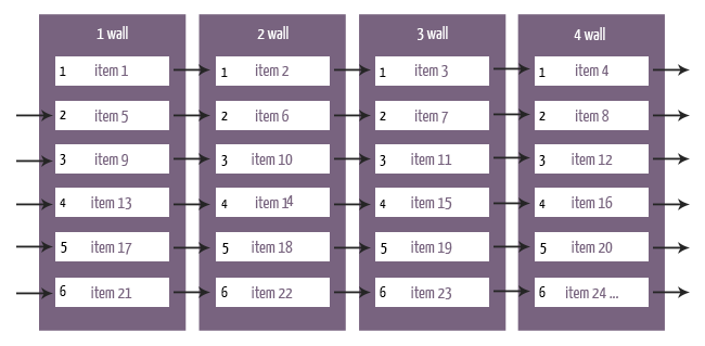
Ordering items on the walls

A cube which is the room that has 6th wall, flor ceils and 4 walls. Every wall has own items to display. All you have to do is apply items <div class="item"> with your image to each wall <div class="wall"> with specify order.

First goes item from :first wall, next goes :first item from the second wall, then :first item from the third wall and :first item from the fourth wall. If you have more then 4 pictures, this process will continue, :secound item from the first wall and so on and on in the circle.

Zoom control

Gallery has a function to switch to zoom mode, in that case, you can switch to this mode by clicking the button. In zoom mode dots are hidden, and you see only the one front image, you can switch images by clicking the next / prev button.

Dark mode control

Gallery has a function to manualy switch to dark mode, you can switch to this mode by clicking the button. Dark mode will automoticly turn on when browser is using dark mode.

HTML sandbox

Use this mockup:


Set up less file

Go to file less/formir/plugins/room.less and change your config

HTML classes setup

You can specify class names for html elements, for example, to avoid name collisions in your app, remember to change classes also on your html:

      
/// CLASSES (name: defualt;)
@room: room;  // main wrapper
@room-dark: room-dark;
@room-body: room-body;  // body of room
@room-arena: room-arena;  // next wrapper coled arena
@room-walls: walls; // walls in 3d
@room-wall: wall;
@room-ceil: ceil;
@room-floor: floor;
@room-item: item; // item to display on the wall
@room-item-image: item-image; // image container
@room-item-desc: item-desc; // image drescription
@room-zoom: room-zoom; // zoom control input
@room-paginations: paginations; // pagination wrapper
@room-navigations: navigations;
@room-zoom-button: zoom;  // button to zoom in
@room-dark-button: dark;
@room-exit-button: exit;  // button to live zoom
@room-canvas: canvas; // class for border/canvas style


Core less variables:

        
/// CORE
@room-max-walls: 30;  // number of max count of walls / items
@room-colors: true; // enable color of button dots/arrow
@room-desc-pre: false; // enable of room-desc as pre text


All less variables:


/// VARIABLES
@room-rotate-speed: 2s;
@room-rotate-timing: ease-in-out;

@room-font-family: Arial, Helvetica, sans-serif;
@room-mobile-media-width: 945px; // not use % unit or calc(), you can use px, rem, cm, vh, vw etc

@room-size-width: 100vmax;
@room-size-height: 100vmin;
@room-perspective: @room-size-width;

@room-mobile-size-width: 100vw; // not use % unit or calc(), you can use px, rem, cm, vh, vw etc - recommend 100vw
@room-mobile-size-height: 100vh; // recomment 100vh
@room-mobile-perspective: @room-mobile-size-width;


@room-scale: 1.1;
@room-scale-zoom: 1.5;
@room-offset-y: 0; // use %

@room-item-height: 90%;
@room-item-width: 90%;

@room-zindex: 1000;

@room-text-font-size: 14px;
@room-text-font-size-mobile: 2vmin;
@room-font-line-height: 1.3em;
@room-text-margin-top: 1.5rem;
@room-text-max-height: 20%;
@room-text-min-height: 10%;
@room-text-max-width: 70%;
@room-text-padding: 20px 0;


@room-navigations-margin: 20px;
@room-button-size: 35px;
@room-pagination-button-size: 25px;
@room-pagination-buttons-space: 3px;


@room-buttons-position: 5%;  // horizontally (y)
@room-button-zoom-position: 10%;
@room-button-dark-position: 10%;
@room-button-zoom-width: @room-button-size;
@room-button-exit-width: @room-button-size;
@room-button-dark-width: @room-button-size;
@room-pagination-position: 5%;

@room-button-opacity: 1;

// Css variables - you can use this variables to modify colors (if you use static ligth or dark mode) without less/sass compiler

@room-body-background: var(--room-body-background);
@room-text-color: var(--room-text-color);
@room-floor-background: var(--room-floor-background);
@room-floor-shadow: var(--room-floor-shadow);
@room-wall-background: var(--room-wall-background);
@room-wall-shadow: var(--room-wall-shadow);
@room-ceil-background: var(--room-ceil-background);
@room-ceil-shadow: var(--room-ceil-shadow);
@room-button-background: var(--room-button-background);
@room-button-color: var(--room-button-color);
@room-button-border: var(--room-button-border);
@room-button-shadow: var(--room-button-shadow);
@room-button-current-background: var(--room-button-current-background);
@room-button-current-border: var(--room-button-current-border);
@room-button-current-color: var(--room-button-current-color);
@room-button-current-shadow: var(--room-button-current-shadow);
@room-canvas-border: var(--room-canvas-border);
@room-canvas-shadow: var(--room-canvas-shadow);

// Light theme:
@light-room-body-background: #fff;
@light-room-text-color: #2d2d2d;
@light-room-floor-background: #bb7631 url('../img/plugins/room/floor.jpg') repeat 180px 180px;
@light-room-floor-shadow: 0 0 100px rgba(0, 0, 0, 0.1), 0 0 150px rgba(0, 0, 0, 0.2) inset;
@light-room-wall-background: @light-room-body-background url('../img/plugins/room/wall.jpg') repeat 180px 180px;
@light-room-wall-shadow: 0 0 50px rgba(0, 0, 0, 0.1), 0 0 100px rgba(0, 0, 0, 0.2) inset;
@light-room-ceil-background: @light-room-body-background url('../img/plugins/room/wall.jpg') repeat 180px 180px;
@light-room-ceil-shadow: 0 0 100px rgba(0, 0, 0, 0.1), 0 0 150px rgba(0, 0, 0, 0.2) inset;
@light-room-button-background: #3c3642;
@light-room-button-color: #fff;
@light-room-button-border: 0 none;
@light-room-button-shadow: 0 0 2px rgba(0, 0, 0, 0.5);
@light-room-button-current-background: #fff;
@light-room-button-current-border: 0 none;
@light-room-button-current-color: @light-room-button-background;
@light-room-button-current-shadow: none;
@light-room-canvas-border: 10px solid @light-room-button-background;
@light-room-canvas-shadow: 1px 1px 3px rgba(0, 0, 0, 0.5);

// Dark theme:
@dark-room-body-background: #1c1e24;
@dark-room-text-color: #fff;
@dark-room-floor-background: #241c11 url('../img/plugins/room/dark-floor.jpg') repeat 150px 150px;
@dark-room-floor-shadow: none;
@dark-room-wall-background: #1c1e24 url('../img/plugins/room/dark-wall.jpg') repeat 150px 150px;
@dark-room-wall-shadow: 0 0 50px rgba(0,0,0,0.7),0 0 100px rgba(0,0,0,0.7) inset;
@dark-room-ceil-background: #1c1e24 url('../img/plugins/room/dark-wall.jpg') repeat 150px 150px;
@dark-room-ceil-shadow: 0 0 100px rgba(0,0,0,0.7),0 0 150px rgba(0,0,0,0.7) inset;
@dark-room-button-background: #fff;
@dark-room-button-color: #000;
@dark-room-button-border: 0 none;
@dark-room-button-shadow: 0 0 2px rgba(0, 0, 0, 0.5);
@dark-room-button-current-background: #000;
@dark-room-button-current-border: 0 none;
@dark-room-button-current-color: #fff;
@dark-room-button-current-shadow: 0 0 5px 5px rgba(255, 255, 255, 0.3);
@dark-room-canvas-border: 10px solid @room-button-background;
@dark-room-canvas-shadow: 0 0 10px rgba(255, 255, 255, 0.1);


Mixings

      
.room-floor() {
  // style for floor
}

.room-wall() {
  // style for each wall
}

.room-ceil() {
  // style of ceil of room
}

.room-item-desc() {
  // style description below image
}

.room-pagination-current() {
  // style for current pagination of dot button
}

.room-button() {
  // style for all buttons
}

.room-prev-button() {
  // style for prev button
}

.room-next-button() {
  // style for next button
}

.room-exit-button() {
  // style for exit button
}

.room-zoom-button() {
  // style for zoom button
}

.room-dark-button() {
  // style for dark mode button
}

.room-dark-button-active() {
  // style for activated dark mode on button
}


Known Edge ( < 80 ) bug:

Many user repor us the same issue at Edge browser with cuting images after interaction with gallery. This is know issue of Edge browser (mixing rotate-3d and animation https://developer.microsoft.com/en-us/microsoft-edge/platform/issues/16452345/ unfortunately this page not exist), solution is to use JS short code and for example jquery (it will be not part of package):


Supported browsers and OS:

  • FF >= 20
  • Safari > 8
  • Chrome >= 35
  • Opera >= 22
  • Edge >= 12 (with JS fix)
  • Edge >= 80
  • Android >= 4.0
  • iOS > 8

Tested on the above-mentioned browsers.

To fully works browser need support 'perspecitive' and 'flex' CSS properties.